Before You Order Your Name Necklace
The best font is the one that makes your exact name look balanced, readable, and beautiful at its actual pendant size.
✦ Always approve the exact spelling, lettering style, and construction before production.
The easiest way to choose among name necklace font styles is to compare your exact name in two or three fonts. Browse our gold name necklace collection to compare how different lettering styles look on finished pieces.
A flowing script can make a short name feel delicate, while a clean block font can help a longer name stay legible on a small pendant. Pay particular attention to the first letter and any letters that connect in an unexpected way.
Popular name necklace font styles at a glance
| Font style | What it looks like | What to check in the preview |
|---|---|---|
| Script | Connected strokes with a cursive rhythm | Whether loops and joined letters are easy to read |
| Block or sans serif | Clean letterforms with minimal decoration | The width of the full name, especially in all caps |
| Serif | Letterforms with small finishing strokes | How fine details look at the finished size |
| Gothic or Old English | Angular, ornate letterforms with strong visual weight | Whether the capital and repeated letters are recognizable |
Match the font to the way the name is written
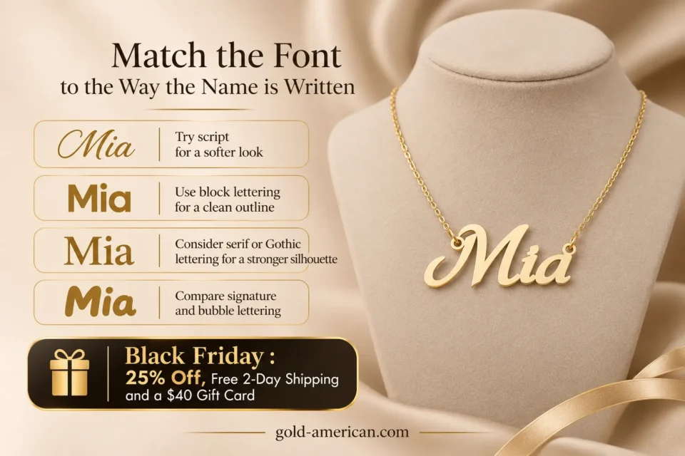
Try script for a softer look
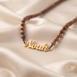
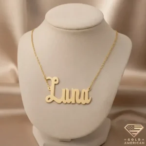
Script can make the pendant feel like a signature. Compare a simple cursive with an ornate version if the first letter has a large flourish. The Noah Script Nameplate Necklace is an example of a script design.
Names with repeated letters, such as Isabella, are worth previewing closely because repeated loops can merge visually when the pendant is small.
Use block lettering for a clean outline
Block fonts suit a minimal look and often make individual letters easier to distinguish. Try both all caps and title case if those options are offered. An all-caps design can feel bold, while title case gives the first letter emphasis and can take up less space depending on the font.
Another interesting aspect of block hand lettering is its simplicity, as explained by hellobrio.com:
The beauty of a block hand lettering style is that you don’t have to outline your letters perfectly from scratch
Consider serif or Gothic lettering for a stronger silhouette
A serif font can give a nameplate a classic look. Gothic lettering adds sharper details and works well as the focal point of an outfit. Look at the whole name instead of judging from a single sample initial, since a decorative capital can be much wider than the rest of the letters.
Compare signature and bubble lettering
A signature font looks more like casual handwriting, often with a loose baseline and a longer entry or exit stroke. Check how far those strokes extend beyond the name.
Bubble lettering has a rounder silhouette and takes up more visual space. If you want a small pendant, check that openings inside letters such as a and e are still easy to distinguish.
How different names behave in the same font
Letter count gives you a starting point. The width, spacing, and shape of individual letters determine how the finished nameplate reads. Try these comparisons in your own preview.
- Ava or Mia: A bold font can give a short name more visual weight. In script, check that the capital does not overwhelm the two following letters.
- Isabella or Lillian: Repeated upright strokes can blend together in tight cursive. Compare the spacing around the repeated l characters and check that i remains recognizable.
- Alexandria: A compact block font or restrained script can keep a longer name readable. Compare the finished width rather than the font’s apparent size on screen.
- Zoë or Ana-María: Check that accents, dots, and hyphens appear in the actual design and ask how separate details will be made.
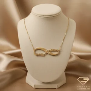
- Two names: Compare one line with a stacked layout if both are available. On one line, check the overall width and the separator. In a stacked design, check that the two names have enough vertical space to read clearly.
Check the design at the pendant’s actual size
Read the finished width and height if the listing provides them. The custom gold name necklace has a live preview for comparing lettering with your own name.
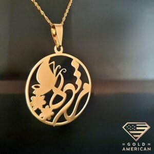
A design that looks clear in a large preview may look crowded at pendant size. For a double name, compare how the design handles the separator and how much space the two names take up together. If you are ordering a name in Persian, Arabic, or another script, confirm the exact spelling and how the letters join in the finished design.
Check How the Letters Will Be Made
4 important details to review before approving your name necklace
Check whether separate letters, dots, or accents need connecting bars, a backing plate, or another support method.
For a solid bar or disc, make sure the letters fit properly within the available engraving space.
Look closely at narrow strokes, joins, and decorative details that may extend beyond what a small preview shows.
Check both attachment points on a two-sided chain. For a single bail, review where the nameplate hangs and how it sits when worn.
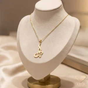
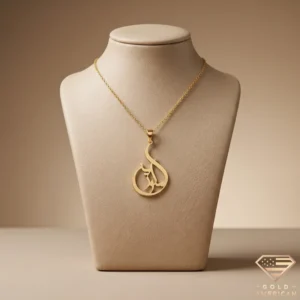
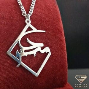
Choosing lettering for Arabic and Persian names
“Arabic script is a cursive writing system; i.e, letters can join to their neighboring letters.”
The W3C’s Arabic & Persian Layout Requirements describes how this writing system works in digital text. For a necklace, review the finished design in the correct reading direction and check which letters should connect.
Some letters leave a natural break. Ask the jeweler how dots and other detached marks will appear in the finished piece. If you are gifting the necklace and are unsure of the spelling, have a fluent reader check the proof before you approve it.
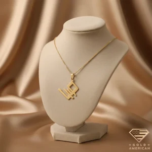
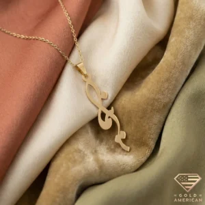
For an example of flowing Persian lettering on a finished pendant, see the Poetic Curve Farsi Name Necklace.
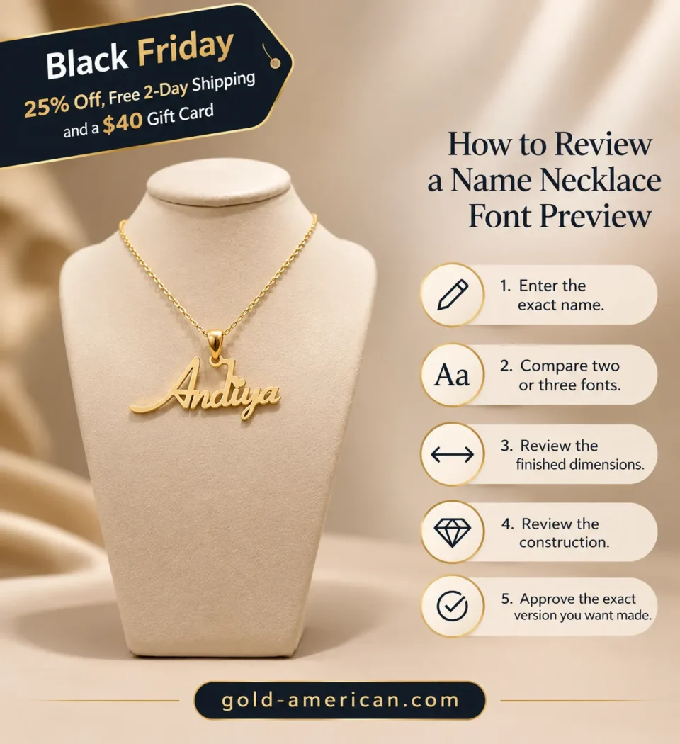
How to review a name necklace font preview
- Enter the exact name. Include capitals, accents, spaces, and punctuation. Check the spelling before comparing styles.
- Compare two or three fonts using the same name. Look for the easiest version to read and the silhouette you prefer. A font chart with a different example name may hide the details that matter for yours.
- Check the finished dimensions. If the proof lists a width, draw that width on paper and hold it against the neckline where you expect the pendant to sit.
- Review the construction. Check chain attachments, narrow joins, and any marks that appear separate. Ask for clarification if the drawing leaves those details unclear.
- Approve the exact version you want made. Compare the final proof with the spelling, font, capitalization, and layout you selected.
Frequently asked questions
Which font looks best for a long name?
Start with a simple script or a compact block font. Compare the full pendant width and check whether adjacent letters remain easy to distinguish. A font with elaborate capitals can add width quickly.
Should I capitalize the first letter?
Title case is a natural choice if you want the pendant to follow the way the name is usually written. All lowercase can give the piece a softer look. Preview the exact capitalization before placing the order.
What is the difference between a script and a signature name necklace?
Script usually refers to decorative cursive lettering. Signature styles tend to imitate more casual handwriting. These labels vary by jeweler, so compare how the two designs render the actual name.
Can I use my own handwriting?
Ask whether the jeweler accepts a handwriting sample and what file or photo they need. If the design is cut out, some strokes may need to be thickened or connected. Check the proof against your original sample before approving it.
What is a good font for a name necklace gift?
Start with simple script if the recipient wears delicate pendants, or clean block lettering if they prefer minimal jewelry. Confirm their preferred spelling, including whether they use a nickname or an accented character. For more ideas, see our personalized jewelry gift guide, which includes name necklaces in several lettering styles.